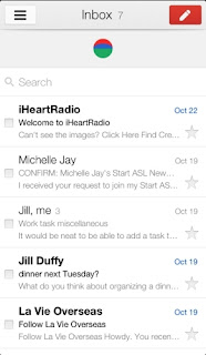
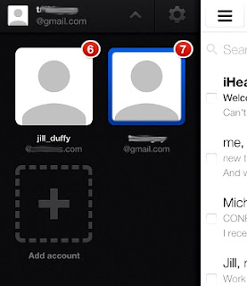
 Since the release of the standalone Gmail app for the iPhone, Google has tweaked and fine-tuned the program mighty little faster, cleaner, more streamlined, and now version 2.0 of the app includes support for multiple accounts, and the search function is more satisfying.
You can already use Gmail on your iPhone, iPad, and iPod touch via Apple's bundled Mail application, but free apps Google itself is simply a better experience, especially for the search. Many people, I believe, will continue to use Mail as their primary email application because it shows you how many inboxes of multiple services at once, but you will want to search at least the Gmail app. And if you are just a Gmail user, can - and very likely will - completely replace Apple's Mail application.
Mail vs. Gmail
The Gmail app benefits from a clean and clear design, with a collapsible menu pane appearing to the left of the central interface, similar to the Facebook iOS app (and increasingly other apps, too).
Toggle the menu open, and it nudges its way into view, taking up not more than half the screen so that it's roomy and easy to read. Here, you can find the requisite Gmail folders, such as Important, Sent, Drafts, and Starred, as well as all the custom folders you've made. Labels, the Trash, and an All Mail button appear at the bottom of the menu, while the top contains a button that lets you quickly switch between your various Gmail accounts.
The Settings, also accessible from a button at the top of the main menu, has one invaluable feature for mobile users: Controls for automated vacation response emails. Who hasn't returned from traveling and forgotten to switch off that interminable out-of-office message? And, the moment you remember, you're never by a computer. Now you don't have to be.
There's a menu listing for Chats, although it's not an active messaging service; it's just a folder (which appears in your web-based Gmail account, too) where your chat conversations are saved if you enable a setting. When you preview messages, the majority of text in the Gmail app appears in light grey type, indicating read messages. The only time you'll see bold or black is for unread mail. Compared to the bold, black lettering of cascading point sizes used in the Mail app, Gmail's text is much harder to read.
Open a message, and each person on the thread appears in a different colour, using the same colour-coding scheme seen on the Gmail website. Whoever initiates a new email has his or her name in green. The first respondent shows up in purple. The third is red, and so on. Threading the messages in this way is a signature Gmail feature.
Message text appears in whatever colour text the sender uses (usually black, with blue for hyperlinks), although other information, such as the sender’s details in a forwarded message, appear in a harder-to-read light grey.
In terms of search performance, the Gmail app outperforms Mail easily, because it searches your entire mailbox, whereas the Mail app prevents you from searching beyond the folder that's open (usually the Inbox).
You can search all Gmail mail from the Mail app, but you have to first navigate to the All Mail folder within your Gmail account, and even there it's restricted to the messages that are loaded. The Mail app gives you results letter-by-letter as it finds matches, in part because it's only searching a limited subsection of your entire mailbox. Gmail waits until you've typed all your letters and hit "Search" before embarking on the hunt to match the terms anywhere in your mail.
 Verdict
Both the Gmail iOS app and the native Mail app connected to a Gmail account do a fine job of getting your messages to you when you're not in front of a full-sized computer. Which one you choose is largely a matter of preference, although I think anyone who uses Gmail nearly exclusively will opt for the official Gmail for iPhone app from Google. It's smooth, fast, and now supports multiple Gmail accounts. Indeed, it’s only slight weak spot is in terms of the available customisation options.
Personally, I use about five email accounts regularly, two of which are Gmail-based, and I use both the Mail app and Gmail app. I like the Mail app because it provides an overview of the activity across all my personal accounts, whereas I access office email from the Gmail app, where search often matters more than in my personal email.
If search is of the utmost essence, you'll definitely appreciate the Gmail app, even if, like me, you end up using both apps. This app is, without doubt, a superb effort from Google, and of course it’s free to download and use.


No comments:
Post a Comment