Showing posts with label Software & Apps. Show all posts

Windows 10 will support the floppy Review 2014


If using floppy disks to install Windows will smile most of you, in a not so distant past, it was the norm when the CD-ROM was far from being present on all computers! Windows 10 goes further and wants to end the use of disks in the system. A serious error quickly reported by many irreducible. But what are their motives?

Microsoft can be proud of its latest operating system dated. Windows 10 enthusiasm most people who have already got hold of a Technical Preview for testing the outline of the OS. But a small element crumples a handful of dissatisfied users of certain choices made by the Redmond company.


The abandonment of the driver to use floppy disks is at the heart of the problem! And no, we're not April 1st. Microsoft has decided to no longer support this possibility largely deserted by many users "modern", but it is not to the liking of everyone judging the fifty posts an official forum Microsoft.

These users and defend tooth and nail their right to have a version compatible with all of their devices, including floppy drive. And we must believe that the movement is important enough that developers of Windows 10 decide to reinstate that function in a future build of Windows 10.

Another victory of the liberation front of the floppy drive? Actually, no. Some companies and some professionals exploit and even the venerable floppy disk to exchange some data (mostly .doc files) rather than the USB key yet largely democratized over the years. Knowing that Windows 10 is intended as much to the general public and professional world, Microsoft sells.

And this is how the disk drive becomes usable again under Windows 10. Any takers?

Amazon offers over € 175 applications and games for Christmas


For Christmas, Amazon decided to be nice to all users of the Amazon Shop over € 175 applications and games are available until Friday, December 26 at midnight. You can download nearly 40 applications totally free, simply for it to have an Amazon account, if this is not the case, create a very simple and fast.

Giant e-commerce does not skimp on the means to make us use his appshop because with this bunch of 40 applications made totally free, it is a rather successful publicity stunt. You may well also use your Amazon account and appshop for this time of Christmas and return later to the Google Play Store or you can use both, one does not preclude the other.


And these are not unknown as applications and games that are part of this selection, because there is the classic TuneIn Radio Pro (which is € 8.92 on the Play Store), the fastest in the world Fleksy keyboard Keyboard (€ 1.62 on the play Store), the 2D Minecraft Terraria (€ 0.79 on the play Store) or the game Worms 3 (0.80 € on the play Store) and all that, for zero euros.

The appshop Amazon was removed from the Play Store for non-compliance with the rules set by Google itself. To access these free applications, so you'll need to download the APK from Amazon Shop and install it on your phone, the whole procedure is explained directly on the page. Simply to have an Android device and an Amazon account to download these applications.

TomTom for iPhone Compatible with iPhone 3G, 3GS and 4 app Review

I tested TomTom on AN Apple iPhone five running iOS half dozen.0.2. The app boots quickly to a main menu that allows you to navigate to a destination, modify your route choices (if one is already in progress), browse the map, set up multi-segment routes, or modification settings. faucet the Navigate To button, and you may see choices for navigating to your home, favourites, recent destinations, specific street addresses, and so on. you'll be able to additionally navigate on to contact addresses, geotagged exposure locations, coordinates, or points on a map in addition. For the foremost half, keying in street addresses was a sleek method in my tests. even as with the company's standalone navigation devices, you input the town 1st, followed by the road name, then the road range.

Searching for points of interest (POI) is additionally customary fare. However, TomTom's dish info is not the greatest, and therefore the class breakdown continues to create very little sense. Food stores, hardware stores, physical science stores, and additional square measure all lumped along in one overcrowded class tagged "shop," whereas there square measure dozens of top-ranking classes for things like veterinarians, water sports, lawn tennis courts, and holidaymaker data offices, that is misguided to mention the smallest amount. Another issue: TomTom has removed its Google native search feature, therefore it’s unfeasible to urge round the internal dish info any longer as you'll in earlier versions of the app.

Performance

Once on the road, TomTom's app is straightforward to use however not notably engaging, with bland graphics and stormy animation that is additional paying homage to a three-year-old standalone GPS. That said, TomTom still leads the pack once it involves displaying route data. You get all manner of knowledge across very cheap of the screen, all of that updates in period. the most show shows this street, subsequent shut down, however far-off it's, your current speed, the ordinance of this road, and therefore the calculable time remaining, distance remaining, and calculable time of arrival. you furthermore may get 3D lane help views, that facilitate with complicated superhighway or heart street layouts, though TomTom's iPhone five optimisations incomprehensible  this screen, as it's indistinct and seems with black bars to either aspect. One annoyance is that clearing a route still takes 3 faucets on 3 separate screens, that is a minimum of 2 too several. Rival Garmin, in distinction, offers a transparent "End Trip" button at very cheap right in the least times. that produces it simple to finish navigation if you are looking for a parking spot close to your destination, or decide mid-route that you simply not would like steering. The latter may be a common prevalence if you are returning from a replacement place and wish navigation simply to urge to a significant superhighway, at that purpose you recognize the remainder of the approach home.

In a series of route tests, TomTom performed specifically needless to say, that is to mention all right. The company's intelligence quotient Routes feature adapts calculable arrival times and matches them to real-world knowledge collected from drivers. Combined with daily Map Share updates, that you'll be able to transfer right from the phone, TomTom's app is arguably additional "plugged in" to current road conditions than the competition. Voice prompts were clear, crisp, and loud. They were additionally well regular, and therefore the app pronounced street names properly in the majority cases. TomTom includes many dozen voices in roughly 24 languages; most do not say street names, however many do. you'll be able to additionally purchase celebrity voices for the app via AN in-app purchase, with choices for the likes of Homer or man Burns from the Simpsons, or Darth Vader or Yoda from Star Wars.

The HD traffic plug-in deserves a special mention. It places a bar on the correct aspect of the screen that represents traffic conditions for your route on the approach. it's extremely spectacular, and therefore the traffic readouts update terribly ofttimes, and forever accurately according what was ahead – even on secondary routes, that was a pleasant surprise. In one specific case, it insisted I exit a unremarkably empty superhighway prior usual. As i believed, "nah, let Maine ignore it and see what happens," right past the exit, I saw brake lights as everybody ahead came to a stop. I exited simply in time. {the only|the thereforele} draw back is that HD traffic is AN in-app purchase so you’ll be paying further for the service.

Price Range : £26.99

WriteBox app Online Text Editor That Connects To Dropbox Review

Writebox encompasses a minimalist interface and extremely very little else, however that is on purpose. By necessity, distraction-free writing apps strip away all manner of excess options to stay you centered on your words instead of however they give the impression of being on the page, and Writebox delivers on it promise however will add a number of essential customisations. When you 1st visit the Writebox web site or launch the Chrome app, there is a button at the highest to sign up. i assumed it might create Maine produce a Writebox account, however instead, it is a Dropbox sign-in that authorises the 2 services to attach. Any time you utilize Writebox, you'll be able to simply sign up together with your Dropbox credentials and not worry regarding making another login – and that’s commendably easy.

In the window could be a tiny top-line menu bar with 3 buttons on the left – New, Open, and a clock-face icon for "recently opened" things. There are 3 buttons on the correct – a wastebin, Account, and choices. you may conjointly notice a set button to force your document changes to Dropbox, ANd an data button with some details regarding the app. Other than that, you will see an enormous, blank screen, wherever you'll be able to sort. At the terribly bottom of the screen square measure period counts for lines, words, and characters, that you'll be able to shut down if you prefer. The customisation choices square measure marginal, however some quite necessary, like having the ability to vary the colors of the text and background, increase or decrease the purpose size and line spacing, and regulate the type.


Hooked up with Dropbox

From the Open button in Writebox, you'll be able to navigate your entire Dropbox folder structure, but only .txt files can seem, as it is the solely file sort supported by this straightforward app. My knowledge primarily embrace Word docs, pictures (JPGs, mostly), PDFs, and surpass files, and that i may see none of them. While writing within the text editor at intervals the Chrome browser, the menu bar at the highest disappeared, making an entirely distraction-free surroundings. you'll be able to boost the read even a lot of by concealment your browser's address bar or otherwise maximizing the window. Mousing back to the highest of the page causes the Writebox menu to come back into read.

The app claims that it mechanically saves each keystroke as you sort, however you are doing ought to hit "sync" or the keyboard road Ctrl + S to push changes to Dropbox. Although the net and Chrome app square measure free, iOS users ought to pay £1.49 for AN put in app on their devices, ANd an golem app is not on the menu in the least. whereas some could be annoyed to procure AN app that is otherwise free, a minimum of the value is cheap and in line with alternative apps of its sort, like PlainText (which is £1.49 for the ad-free version).

Latest Apple has Announces Apple TV Software 6.0

Apple TV Software 6.0
After the original versions of many problems including slow download, lost libraries and even some bricking clearly led the company to pull it from the server. lately Apple has reintroduced update 6.0 for the Apple TV was released last week. This update back to life now, with new features including access to the iTunes Music Store to actually buy songs and albums from your device and iTunes Radio, Apple's new service free online streaming music.

This new feature of iCloud is equipped with AirPlay, which allows you to play the video on Apple TV purchase history is stored in your iCloud directly to the device via streaming, without the need to be locally in the second (which need to be activated in the settings). There is also the addition of iCloud Photo and Video, which is basically just rebrands Photo Stream, access to Podcasts and Podcast Station, and a new conference room mode, which displays a custom background with instructions on how to connect to the network and devices to the Apple TV or a guest presenter might want to use the attached A / V equipment.

None of the updates are super surprising, bringing support for features included in iOS 7, but the iCloud streaming playback offers Apple TV and AirPlay users one small feature the service was lacking compared to Google’s Chromecast, and the new conference room mode is actually a big boon for Apple in terms of selling these things through to enterprise and business users as support devices for throughout offices. The update also comes just ahead of what many predict will be a hardware refresh for the device in the next month or two.

The update is available now over-the-air, and should show up in Apple TV device settings screens. Bugs users were reporting earlier should be fixed, but let us know if you find otherwise.

Source [ techcrunch.com ]

Get Facebook for iOS 7 Style Redesign 2013

Get Facebook for iOS 7-style redesign
One of the major app redesigns has been done by Facebook for its iPhone app. The social networking service has completely revamped its iOS app not just for iOS 7 but also for other versions of iOS including iOS 5 and iOS 6. Facebook has always used a more custom design instead of going with iOS style navigation elements. However, the updated app in a way switches to more iOS-like navigation with a new bar at the bottom of the app, that features buttons for News feed, Friend Requests, messages, notifications, and a More button that offers a menu which was previously included in a sliding pane at the left hand, a feature that some people also call the Hamburger menu.

The bar is white in colour with grey text and icons for passive tabs and blue text and icon for the active one in iOS 7. The same bar is black and follows the old iOS design scheme on iOS 5 and iOS 6. The top header is also translucent on iOS 7. The More menu features the user profile, Nearby Places to check-in, other Pages that you're moderating, Groups, Events, Friends lists, Photos and other options. The app header features a Search button and a button for bringing the Chat sliding pane at the right hand. The News Feed tab also offers three buttons at the top for posting a status message, uploading a Photo and Checking in at a place.

The Facebook app for iOS is a universal app, which means the same app also runs on the iPad. However, the iPad counterpart still retains the original UI elements including the sliding pane at the left hand and three small icons for Friend requests, Messages, and Notifications at the top header. However, the header now sports blue colour. The new app is now live on the iTunes App Store. However, it could take some time till you see an update option, while it rolls out to all regions.

Source [ gadgets.ndtv.com ]

Springpad Apps Review

This free web app is not nearly as social as Pinterest, nor as well designed. However, it offers an online collage-making experience that extends far beyond what Pinterest covers, borrowing ideas from note-taking apps such as Evernote – like allowing for typed "notes" in addition to images, and using tags for better sorting and searching – to round out the list of ways in which you can use Springpad. The similarities to Evernote aren't as strong as the comparisons with Pinterest, which can cause some confusion because Springpad is typically classified alongside Evernote. Think of Springpad as more like an enhanced Pinterest but with less social activity, and you'll be set.

Part of that is to do with the content that's on each site, and Pinterest simply has a wider, ever-growing catalogue, although Springpad works much better as a personal or private space. If you want to keep virtual pinboards for your own notes and ideas, and not necessarily share them with the world, you're better off with Springpad.


Signature features and design

One aspect of Springpad that's quite different from Pinterest is that pins, or "springs" as they're called here, can take a variety of forms, whereas on Pinterest they may only be images and videos. With Springpad, however, a spring can be a note, to-do task, web clip, link, file, image, event, and more. The "more" list comprises a few rather odd categories, such as an alarm (email reminder sent at a specific time), recipe, book, product, and this is a slightly trickier area to explain. All this "more" stuff connects to a database of sorts where you'll find suggestions. It's a little similar to "liking" brands, celebrities, and other fan page content on Facebook.

So, say for example that in Springpad you elect to create a new item in one of your notebooks that's a TV show. The app pulls up a list of suggestions from which you can choose. The problem is the results aren't always useful. While I found books by authors' last names and TV shows by title, when I searched for something as generic as "bag," my first result was a sack of dog food (see the below image). As you use the app to create notes, to-do items, or web clips, you'll have the opportunity to organise them into "notebooks" or collage boards. Each notebook can have its own name, description, and colour theme. The home screen always shows you all your notebooks laid out visually, in a grid, with the total number of items in each notebook displayed on each one, as well as whether the board is private or public, and if the latter, how many followers are watching it. Springpad finds a nice balance between form and function on this home screen.

The general navigation could and should be expanded to give users more top-line functionality within easy reach from any page. As it is, the navigation menu has My Notebooks, Following, and Explore. I'd like to see a list of all my notebooks in a vertical left rail or perhaps in a scrolling strip along the bottom at every step, because notebooks are central to the experience. I should be able to access them, browse the list of them, and jump between them with ease. The way it's structured currently, you have to flip between multiple pages to get from one notebook to the next. As you dive into some of the other features – creating and tagging notes, adding due dates to items, clipping part of a web page – it's even more difficult at times to remember where you are and from where you came. A little more structure would go a long way. Unlike Pinterest, Springpad's dashboard and workspaces are more freeform, too. You can drag and drop clips around as if you were arranging them on a poster board, or set them to display in a locked grid.

Another one of Springpad's signature features is that you can save notes and ideas in the form of web clips using a one-click extension for Google Chrome or Mozilla Firefox. Browse for visual ideas about your next vacation or how you want to redesign your home, and you can cobble them into a digital scrapbook. Springpad's plug-in works much more reliably than Pinterest's "pin it" bookmarklet (which just searches the active page for an image to copy and save), and offers many more features, too. Click on the extension, and you see choices to add a web clip, type a new note, add a to-do item, and so forth. When a web clipping is indeed what you want, you can sort and tag clips into various notebooks, create items with due dates, and more.

Setup

Anyone can sign up for Springpad, which is free, by providing an email address and creating a password. You have the option to provide additional information, such as your full name or photo, as well as connecting to Twitter, Facebook, Yahoo!, and Gmail accounts. Springpad does have some sharing and social features tied into the site, although they're not nearly as enticing to use as Pinterest's, in part because boards on Springpad are private by default, so there's less to see. (It's worth noting that Pinterest simply has a larger community and thus more content). You can search boards that are made public, however, and follow them for future updates and activity. You can "re-pin" an item from someone else's board to one of your own, just as on Pinterest. But unlike Pinterest, which restricts users to having no more than three private boards, you can have as many private boards as you want on Springpad.

Software : Free

Apple Maps App GPS Navigation For iPhone Review

 All told, Apple Maps still feels more like a tech demo rather than a navigation application that's meant to be used often. The inaccurate POIs and missing features only reinforce that impression. Simply put, this is a gorgeous app that needs better data – the sad fact being that if this issue wasn’t so bad, Apple Maps could have hit a 7 or 8 out of 10 score, based on its other features. However, the POI and address inaccuracies are so serious, and so hamper your ability to use this app, that we're going to have to give it a 5.

For now, Google Maps is the app to beat when it comes to free, accurate driving and pedestrian directions for your iPhone, and Google's own vector-based mapping engine also looks great, even if it lacks the visual pizazz of Apple Maps. The bare truth of it is that Apple Maps still needs a lot of work.

Performance

Once en route, the app really shows its stuff. The 3D buildings look gorgeous, and map animation is super-smooth. I really like the way the camera panned around to follow what I was doing – this single trick makes other GPS apps look dated. During navigation, Apple Maps presents the next one or two steps using giant green road signs – it's easy to read at a glance. That said, the font in the top bar is really small, so it's tough to read your ETA or distance remaining for the whole trip. You can also tap a button to open a list of step-by-step directions. I didn't run into any actual navigation issues during testing – once on the road, the app seemed to work well. On the audio side, voice prompts were exceptional: Loud, clear, and well-timed. I couldn't believe how loud the iPhone 5's speaker sounded with this app. Text-to-speech also worked perfectly, and I didn't hear any weird pronunciations during testing.

Lots of stuff is missing, though. There are no road speed limit signs or current speed indicator. There's no lane assistance for exiting or entering motorways, either in 2D or 3D. You can't tap the display to repeat a voice command in case you didn't hear it. And as has been widely reported, there are no photorealistic street views like there are with Google Maps, and there's no public transit information for pedestrian navigation. The much-touted, photo-realistic flyovers are fun, but you can only get them in a few major UK cities currently, and at any rate, I'd gladly trade any such fanciness for some of the more useful missing features I just listed.

Traffic reporting, while present, is sporadic and lacks detail; all you get are dotted lines on the map representing areas of congestion. While Apple Maps has real-time traffic data with the ability to reroute around jams, you can't see it at a glance across your whole trip during actual 3D navigation, so you can't plan ahead the way you can with, say, TomTom for iPhone.

User interface

For this review, I tested Apple Maps with an iPhone 5 running iOS 6.0.2. I was hoping that by this time, three months after the launch of iOS 6, Apple would have incorporated some serious improvements. Unfortunately, that doesn’t appear to be the case. The basic user interface is familiar enough. Tap the lower left button to bring up your current location and compass direction. Tap the bottom right corner, and the map will curl up to the left, showing buttons for dropping a pin, displaying traffic, or activating hybrid and satellite views. The satellite view is weird; it animates smoothly, but everything looks a little crunched and distorted. The standard road display is better, but even then, the app has a curious way of highlighting strange neighbourhood names and landmarks, rather than the major ones you'd expect it to flag up.

The tiny Search bar is difficult to activate, but once you do, you can input a street address or type in search terms. Typing "pizza" brought up 10 places scattered across town; I zoomed into the map and ran the search again, with much more localised results. It always missed my favourite pizza place just around the corner, however, and it’s not like it just sprung up – it has been there for over 20 years. This type of missing data was par for the course, sadly. On the other hand, POI data pages look great, with slowly panning, Ken Burns-style photo display and access to Yelp reviews. And with a single tap, you can navigate to any POI you searched for – something that Google Maps actually gets wrong, as it requires shifting to a different mode (Directions) and takes several extra taps.

Built-in Siri integration lets you speak destinations into the phone. But while Siri tends to be more accurate than Google Now on Android phones in terms of voice recognition, Google Maps still beats Siri for its ability to parse complex sentences.


Software : Free

PhotoPlus X6 Photo Editing From Serif Review

This time with PhotoPlus X6, the software gets a boost with a new 64-bit image processing engine, Smart Selection and Edge Refinement tools, noise reduction, and a tilt-shift effect. Despite its relatively low price of £75 (direct from Serif), PhotoPlus includes many features found in Photoshop and Lightroom, and some not found in its near-identically-priced competitor, Photoshop Elements, such as non-destructive cropping and RGB curve editing. However, the less positive news is that even with these goodies on board, PhotoPlus still can't match Adobe's apps in terms of either ease or power.

Setup

PhotoPlus X6 is compatible with Windows 8, 7, Vista, and XP. At install, you'll need the serial number, which is not on the disc or disc case, but on your invoice, so don't discard that immediately, like I did! During the installation wizard, you're asked which files you want PhotoPlus to handle by default, and you can choose whether to install sample images. I did appreciate that the installation didn't require a lot of ancillary installations of runtimes and the like, and that I wasn't pressed to install a browser toolbar, the way I have been with other apps.


Interface

You start out in PhotoPlus with help all over the main interface: At the centre is a panel offering learning videos and links for the program's main operations – Start New Image, Start New Animation, HDR Photo Merge, and Open PhotoPlus Organiser. This last element is something I had an issue with when using the previous version of the product: The organiser was too separate from the editor, and this remains the case. There are buttons that take you between the two modes, but often they didn't actually switch to the other mode. Toolbars stretch across the top and down the left side, and an info/control panel graces the right side of the program's window. At first run, a How To panel also appeared next to the left edge panel. This offered basic training like Adjusting Images, Retouching Images, and Creative Effects.

After working on an image in the editor and then moving back to the Organiser, that helper app didn't open with the image I'd just been working on, and I had to dig through my photo folders if I wanted to share that image or do some other organising with it. This is just the sort of lack of helpfulness and intuitiveness you run across with this program. Another is that the filename doesn't display anywhere when you open a full view of an image in Organiser. I did, however, like how spinning the mouse wheel zoomed in and out, without even holding a shift key down. You can also zoom in further in this latest version of the program, helpful for detail work. Different layouts are available for the interface, with those optimised for Designers, Painters, or Photo Editing, in addition to the default layout. One thing I didn't see here was an Import option. More on that in the next section.


Import and organise

It turns out that there's no importing capability in the photo editor, but you need to run the external PhotoPlus Organiser to take care of this, just as when using Photoshop you have to run Bridge or with Photoshop Elements, Organiser. Nor does the PhotoPlus installer add an import option to the AutoPlay dialog that appears when you insert camera memory. I could import raw camera files like Canon .CR2 files, but thumbnails for these didn't display in the import dialog, though those for JPGs did. You can tell the importer to create a new folder, but by default, it just dumped image files into the root Pictures folder, which isn’t ideal for organisation.

The Organiser lacks other tools helpful in organisation found in rival photo software – flag and reject, and colour coding, for example. Most photo organisation software overlays quick choices for things like ratings when you hover the mouse over a thumbnail, but not PhotoPlus. A right click menu does offer rotation, preset tags, and even geotagging (but no people or face tagging). The geo-tagging offers basic online map integration with the ability to create a slideshow of photos from a location.An import of 43 raw files, each about 20MB, took 4 minutes and 44 seconds. By comparison, the same import in Adobe Photoshop Elements took 3 minutes and 8 seconds, and took me straight to the freshly imported images when done. When the PhotoPlus import was finished, I wasn't taken to the folder of my just-imported photos, and there was no way to view just photos from my last import session: The Organiser simply drops the photo files into a subfolder under Pictures.

Adjusting photos

As in Photoshop, PhotoPlus' image adjustment isn't automatically non-destructive – you have to create new layers to make it so. New with this version is a Destructive check box that's unchecked by default. Helpfully, the app will display a message telling you to save the image in the program's own .spp format so that you don't overwrite your original by accident. The right side panel offers standard adjustment tools – Levels, Curves, Colour, Brightness/Contrast, HSL, and more. Image layers a la Photoshop appear at the bottom of this panel. This time, I found the Levels tool's Auto Adjust button, and it worked quite well on some test images, but it made some dark scenes even darker.

In fact many of PhotoPlus' adjustments are only available in the PhotoFix dialog but not in the main app, including noise reduction and chromatic aberration correction. I was surprised that the PhotoFix offered adjustments for shadows and highlights, but the main editor's levels and brightness/contrast tools in the sidebar did not. Also, after starting to edit with the main editor, the PhotoFix button was disabled. I could, however, choose the Shadow/Highlight/Midtone tool from the Image menu to get at these controls. This tool has sliders for intensity, range, and radius of shadows and highlights, but even though I had the preview checkbox checked, I didn't see its effect for images shot with an iPhone. It worked with other JPGs and raw files.

One nice tool that seemed a little out of place in the Raw Import/PhotoFix dialog was Edit Mask, which made it easy to select similar areas of the photo and selectively apply adjustments to only those. Adjustment brushes, though, are completely missing. This kind of tool, which lets you brush on effects like white balance changes, and contrast, has made its way into nearly all photo editors at this point.

Price : £75

Serif.com

Waze Social GPS, Maps & Traffic for iPhone Review

 
Waze has proved that crowdsourced GPS navigation is viable – and it keeps getting better. At its core, Waze gives you voice-enabled GPS directions on your iOS or Android device, and best of all, it's free.

The app still isn’t perfect, mind, but if you're willing to trade a little routing efficiency for features you can't find on other navigation apps, like real-world travel times and up-to-the-minute, user-reported traffic jams, Waze is definitely worth checking out.

Performance

While en route, Waze still doesn't display the current road speed limit, and there's no 2D or 3D lane assistance. On the plus side, the colourful, animated traffic icons showing the current status and delay times looked sharp on the map. Real-time traffic alerts worked well, and gave me plenty of options throughout a given trip.

Tap the exclamation point on the bottom right, and it will pop up nine icons to report an accident, police activity, heavy traffic, and other road hazards. In landscape mode, it will only show six icons, though; you need to scroll to the right to see the other three. Still, this is where Waze really shines – the app popped up plenty of real-time traffic alerts during the review period.

And on one test route in particular, Waze popped up an alert that there was police activity coming up 400 feet ahead. And there was! There was a police car at the side of the road with its lights on. Waze prompted me to either give it a thumbs up (meaning the report was correct), tell it that it was close but not exact, or tell it that there was in fact no police presence.

Voice prompts were mostly understandable, but compared with Google Maps and Apple Maps, they were much too low in volume and also sounded overly compressed and a bit muddy. I didn't hear any pronunciation gaffes with Waze this time around. One other issue: Waze crashed a few times while I was using it, though the crashes were easy to recover from; I just started the app again and it remembered where I left off.


User interface

For this review, I tested Waze 3.5.1 on an Apple iPhone 5 running iOS 6.0.2. Here's how it works: Waze connects you to other drivers automatically (and anonymously) in the background. The app then pools data from everyone and channels it into more efficient, time-saving routing algorithms based on real-world trip data from other users, not just what the map data infers. This is essentially what TomTom does with its long-standing IQ Routes feature, but until Waze came along, we hadn't seen it on a free phone app before.

On the display, cute little icons show you where other Waze users are as you drive around. Do note, however, that crowdsourcing isn't a panacea, as the app's underlying routing algorithms need to be sound. Fortunately, just as promised, Waze has improved a lot over the past year since we last used it. This time around, it got all the routes I tried with it correct, displaying some impressive navigation knowledge.

Waze is capable of weighing up factors including not just the length of a route, and is pretty sharp at estimating travel time and knowing which way is best and not just technically the shortest route. I encountered several instances where Waze nailed the ETA in actuality, whereas Garmin's GPS guessed I'd arrive earlier, only to adjust itself as the trip went on to eventually match what Waze had said all along.


waze.com

The Official Twitter iPhone app (which is free)


Twitter remains one of the most active and attractive social networks. And the mobile experience is key to its success. The official Twitter iPhone app (which is free) balances simplicity with essential features, such as the ability to maintain more than one account from the app, adroitly enough to keep it relevant among contenders. It also doesn't hurt that Twitter purchased its main competitor TweetDeck, thus preventing that app from outpacing its own.Stability and reliability also count for something, and while Twitter delivers well enough on both counts, it's still far from perfect on either. Drafted tweets sometimes hang in the ether until you delete them and start afresh, and the site goes down from time to time.

Design and features

A clean user experience and smart design put the Twitter iPhone app in the big leagues. In the early days of Twitter, its own apps weren't as competitive and feature-rich as those which third parties built for the 140-character-driven social network. The iPhone app was Twitter's first mobile version to fully mature, and after five major iterations (this review is of version 5.2) the official Twitter-branded app is the way to go for many users. Best of all, if you don't have a Twitter account and aren't interested in joining, you can still use the app to search and read the site.

After downloading and installing the Twitter app, you can start using it immediately, even before you authenticate an account. The app mimics Twitter's website by allowing even non-members to search and read the site, a token feature that will surely win over lurkers far and wide.

More likely than not, though, if you're downloading the app, you do have a Twitter user name and password, and perhaps more than one. To add more accounts, you first have to be logged in – then tap the options button (three circles at bottom right), select Accounts & Settings, and use the plus sign at the top right to add more accounts. After you've set up all your accounts, you can toggle between them using the Accounts button. Switching among accounts is easy, fast, and efficient.

Rather than bombard your eyes with a rainbow of colours, the Twitter app sticks to a more sophisticated colour scheme of black and white, reserving muted shades of digital bluebird blue for the top of the screen only. It looks practical without being too serious, a simple design that takes into consideration the growing number of business users and content on the site. The app's look is sharp enough to still be appealing to people who use Twitter for personal or casual reasons, too.

A nice touch on the interactive side: Double-tapping the home icon at the lower left forces the window to scroll back to the top automatically, which means less finger flicking for users.

Photo effects

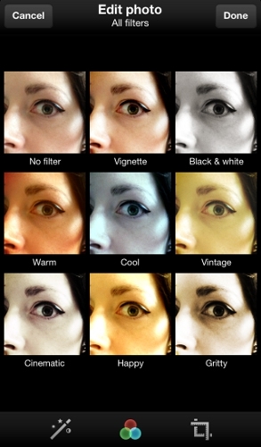
The newest feature, photo filters, mimics the basic functionality of photo sharing site Instagram to a large extent, and it's only available on Twitter's mobile apps, not the website. Snap a photo using your iPhone, and Twitter offers dramatic filter effects, cropping and resizing tools, and an auto-enhance button.

Twitter has eight photo effects in all: Vignette, black and white, warm, cool, vintage, cinematic, happy, and gritty. A ninth option in the interface is "No Filter," which I'm going to say doesn't count. You can see all the photo filters applied to the same image in a grid, helping you decide which one is the best fit, which is quite different from the Instagram experience in which you swipe through previews but can't see side-by-side comparisons. Twitter also does offer the ability to page through the images one by one in a slideshow, if you prefer (I don't).

Drafts

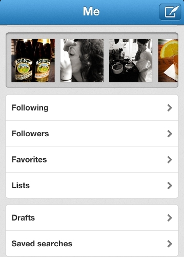
Each account has its own options panel, where you can access your profile, account settings, user lists that you follow, favourite tweets, and drafts of tweets that haven't been sent yet. Drafts would be one of my favourite features of the Twitter app, except that it's slightly confusing when you look at the options that are available.

It seems as if you can enter the draft area and write a message (pen-on-paper icon) to save as a draft. But once you compose your message, the options are "send" or "cancel." There's no "save as a draft" immediately apparent; there is an option to "save as draft" if you select cancel, but I hate that it's not where I expect it to be.

If you select send, the message goes live immediately. Tweets also save as drafts when the site goes down or you have connectivity problems. But in my experience, these drafts can sometimes hang in limbo for eternity, never posting no matter how long I wait after regaining service. All that's left to do is copy the text, delete the original message, and paste the content into a new tweet.
Twitter's iPhone app doesn't have the ability to schedule tweets to post at a later date and time, a highly desired feature. Social media power users who need this feature can find it in an aggregation app, like Hootsuite and Seesmic.

Apple GarageBand 1.3 Lets You Make Ringtones for Your iPhone, iPad

The instruments on the main menu aren't only ones you can play, either. For example, the keyboard instrument defaults to a grand piano sound, but you can tap the icon and choose from a selection of over 70 other keyboard and synthesiser patches. The drum instrument offers three acoustic kits and three electronic kits, the latter of which you play with a pad-style interface instead of a visual representation of a drum set. When recording audio, you can record full-blown vocal or guitar tracks, or sample short bursts of audio that then automatically map across a virtual keyboard on screen. The guitar amp offers nine different amp models and 10 stompbox effects (though for these, you'll need to plug in a real electric guitar, using a device like the Apogee Jam).

GarageBand's claim to fame, aside from its excellent sound quality, is its easy live playback and recording modes. For example, the Smart Guitar defaults to a series of chords that sound good together; strum the on-screen strings, and it's impossible to make a mistake. Beginning in this version, you can now customise the chords, which lets you program your own (such as a seventh or a ninth), or add in the ones from a songbook so you can then jam in the right key. The piano mode is more freeform and like a regular piano to begin with, but you get plenty of customisation options here, including keys of three different widths, a second tier of keys, and the ability to choose your octave, scale, and whether the sustain pedal is pressed.


The latest version, 1.3, adds several new features – chief among them the ability for GarageBand to work smoothly in the background while you play other iPad music apps on top of it. And as always, GarageBand for iPad sounds great, and it remains as easy to dive into as ever. There's serious competition when it comes to music making on the iPad, but for just £2.99, you simply can't go wrong with this app.


At any time, you can begin recording by setting the tempo and tapping the record button on top; this will create a new track, and let you stack instruments one by one in true multi-track fashion (up to eight tracks). Once you've recorded something, you'll want to take a better look at it. The Tracks page works like a desktop sequencer's Arrange window, and lets you shorten, copy, or drag parts around on each track. GarageBand's recording modes alone are enough to vault it ahead of IK Multimedia SampleTank (which is £13.99, though currently on offer at half price), which also offers expressive, nice sounding instruments, but is sorely lacking in the recording department. 

Across the various smart instruments in GarageBand, you'll also find hundreds of auto-play loops and arpeggiated patterns, often with three or four choices for each sound. These also map automatically to GarageBand's new 3/4 and 6/8 time signatures in addition to 4/4 (though they obviously change a bit when that happens, since you can't fit as many notes into each pattern as with the other time signatures). You can tap with two or three fingers and bring up variations, and also record these loops and manipulate them, just like other song data.

It's almost impossible to overstate how easy all of this makes it for a beginner to just jump in and start making music. That's probably GarageBand's biggest appeal on the iPad just in general, and that trait is preserved, and arguably even enhanced, in this latest version. It makes GarageBand a great tool for teaching you how to make and record music in a variety of styles.

It won't teach you how to play an instrument, since you can set it so that you never make mistakes, and the actual finger positions are hidden on some of the instruments. But since it's an iPad, that's understandable – and GarageBand '11 (£10.49) on the Mac desktop actually does have dozens of tutorial videos available, if you want to go that route.


Jam Session and Note Editor

Jam Session lets you and up to three other players jam together over local Wi-Fi or Bluetooth using the same tempo, key signature, meter, and set of chords. It works with any iPad, any iPhone 4 or newer, and any fourth generation or newer iPod touch. Whoever sets up the session is the band leader, who can then decide to record the session at any point; from then on, all devices begin recording.

Once recording stops, all three additional recorded tracks are sent automatically to the band leader's device for further editing and mixing. I got a small two person session going with the iPad 3 and a nearby iPhone 5; the two devices synced up perfectly, and my electric organ recording on the iPhone appeared instantly on the iPad, on top of existing tracks, when I was done.

The Note Editor, introduced in version 1.2, brought GarageBand for iPad much closer to the desktop version, as well as other iPad recording apps like Blip Interactive NanoStudio (£10.49) and Image Line FL Studio Mobile HD (£13.99). It allows basic after-the-fact note editing for pitch, velocity, and duration. This means you no longer have to record an entire part after making a mistake.

Double-tap on a recorded track, then tap Edit, and a piano roll-style editor opens up that you can pinch zoom in and out of. Whenever you tap on a note, it highlights; you can then cut, copy, or delete it, modify its velocity, or drag its position and length. The note editor is also context sensitive – edit drums, and you'll see a pattern-based grid view with icons on the left representing each drum, instead of piano keys.

Recordings are automatically quantised to a 32nd-note grid, and it's non-destructive; you can turn it off and revert to the original data. But you can't adjust the grid or quantise strength in any way. You can add new notes, but you can't transpose existing ones (except individually, or on a global track basis), or otherwise perform any more advanced editing.

But it's a start, and a good one. And I liked the touch-based piano roll editing; it felt quite intuitive when compared with the more typical keyboard-and-mouse style you'd find in desktop software. Plus, a new Track Merge feature lets you bounce tracks down into a single track, which gives you more room for adding additional tracks.

Instrument sounds

Smart Strings contains some surprising power just beneath the surface. The string sounds are wonderfully expressive, with pizzicato, arco staccato, and legato articulations available depending on how you tap or strike the chord keys. You can also speed up the back-and-forth swipes to build a crescendo or diminuendo, and alternate up and down bow strokes for a more natural sound (and no "machine gun" effect). Playing individual notes is much tougher, thanks to the lack of frets on the fretboard of each instrument. I suppose that mimics real life, but try as I could, I couldn't get a solo legato line out that sounded halfway decent for the life of me.

New for version 1.3 is the ability to play or record with GarageBand in the background while using other apps. This means you can pipe in, say, the sound from Korg iPolySix, into a record-enabled audio track in GarageBand. It's a killer feature, because before this, you either needed to do a lot of app switching, or you needed multiple iPads hooked into each other. Live performers may still want multiple iPads on stage, but allowing for background recording and playback goes a long way.

On the other hand, GarageBand's recording and playback modes remain inflexible at times. For example, you still can't impose the on-screen piano keyboard on the drum, bass, and guitar sounds, the way you can with Blip Interactive NanoStudio. If you've ever recorded anything in desktop music software before, your hands are used to General MIDI-style drum set keys. With the kick and snare reversed in the drum view, and the hi-hat above them, it's tough to play a real-time beat without relearning your technique.

You also can't swap the smart instrument interfaces for an on-screen keyboard either. This won't necessarily matter if you're starting fresh, but it will matter if you use any other recording apps besides GarageBand, or graduate to any desktop-based recording tools, nearly all of which follow standard conventions.

Project management

You can publish songs directly to Facebook, YouTube, or SoundCloud, as well as export finished audio to iMovie for custom soundtracks. GarageBand 1.3 lets you import songs from the music library on your iOS device, giving you another way to bring in recordings you've made in another app.

You can also export newly minted recordings from GarageBand as ringtones, assuming you have an iOS 6 device. GarageBand includes a folder-based song browser for managing your recordings, plus support for iCloud, which lets you keep projects in sync across different iOS devices. That's great if you want to continue working on a song you started on your iPad back at home, but only have your iPhone with you on the go.

But the way the iPad works, you're also limited in what you can do with your projects. You can open any songs directly in the desktop versions of GarageBand or Logic Pro, including MIDI data recorded from smart instruments (if not the smart instruments themselves). But you still need to sync a specific iPad to a specific machine; for example, you can't just grab a few people in a room, record a jam session, and then move that project immediately to any nearby computer. One of those iPads must sync to a computer in that room (or somewhere else), iCloud notwithstanding.

You also can't open projects in other sequencers, or on a PC; you can only export finished stereo audio files, though you can import those into another program as a stereo audio track, and then keep adding tracks if you desire.

Finally, Apple claims to have addressed some issues "related to overall performance and stability" with version 1.3. I can say that the occasional note choppiness I heard in GarageBand 1.2 is gone, at least from my own experience. The fact that this app still works on all iPads, even the first one – minus a few features like Jam Session – is testament to Apple's coding skills, and the flexibility of iOS in general.


Company : Apple
Price : £2.99
Website : apple.com


Snapseed For Android Apps on Google Play Review

A year after being named the iPad app of the year by Apple in 2011, Nik Software's impressive tablet photo editor has arrived on Android. Maybe that's not such a huge surprise, considering that Android creator Google purchased Nik Software, the maker of Snapseed, this past September. Though it doesn't have quite the stunning interface of Apple's iPhoto for iOS, or some of the mind-blowing content-aware tricks of Adobe Photoshop Touch, Snapseed remains one of the most powerful image editors available for tablets. And best of all? It's now free (as is its iOS counterpart).


Interface

Snapseed for Android's interface is nearly identical to that of the iPad app. It's simple and clear, yet it packs in a lot of power and in-depth detail. After you open or shoot a photo, you'll see rectangles along the bottom of the screen (or along the side if you're in landscape orientation), which you can swipe through to choose edits, adjustments, and effects. Simple swiping gestures let you adjust contrast, brightness, and colour; or you can have the program select those automatically, or choose control points in the image.

An always-present icon lets you compare your edited work with the original, and the original image is always saved – the editor is non-destructive, in other words. A question mark is always available in the upper right hand corner, and touching it overlays helpful hand-drawn instructions showing where to tap or swipe to perform a function (see the image above).

The app adroitly handles photo-fixing basics such as brightness, contrast, cropping, and straightening. For Snapseed's sharpening capability, accessible from the Details option, Nik borrows from its pro-level Photoshop plugin, Sharpener Pro 3.0. This even lets you adjust sliders for strength and "structure," providing a powerful way to bring out hidden textures.

I was also impressed that many of the adjustments and effects can be applied to specific areas of the image using control points in the app's Selective Adjust and Selective Focus sections. These let you apply brightness, contrast, and saturation to an adjustable circular region of the photo. You drag one finger in and out while holding the other on the control point to enlarge or shrink the affected area, which is shown by a red overlay. Adobe's Photoshop Touch app, however, outperforms Snapseed in this department, with desktop-Photoshop-like local brushes. That app also surpasses Snapseed in terms of capabilities such as removing background objects, and working with image layers.

 Snapseed's Drama tool did indeed add drama to a bleak landscape I tried it on, while Vintage (see above) offers nine old-fashioned photo looks and several texture options. Grunge is one of Snapseed's most impressive tools, with a whopping 1,500 style settings, each offering different degrees of colour emphasis or fading. Once you're done with tweaking the actual image, you can place it in a choice of frames that give the photo a mounted appearance.

Snapseed offers one of the hottest effects in digital photography today – "tilt shift" (see the pic below). I use quotation marks because although this is the popular term for the miniaturisation and saturation technique, tilt-shift is actually a geometry effect only possible with expensive lenses. Snapseed lets you choose an elliptical or linear focus area for the effect, and you can change the angle and thickness of the focus area. This is actually more control over the tilt shift effect than you'll find in some desktop apps, and the results can be impressive.


Sharing
Unfortunately, Google is using this app as another way to pump up its under-populated social network. To that end, there's a big Google+ button below your photo on the main screen. Fortunately, you can share to places you're more likely to have contacts on from the Share menu available from the options, top right. This will make any service’s app you've installed a sharing target; on my test tablet, I could share to Pinterest, Facebook, Box, and several more.

Instagram certainly offers fun ways to doll up your photos, and a compelling social photo community – albeit one embroiled in controversial debate this week – but Snapseed is more capable and powerful when it comes to enhancing images. True, it lacks the flashy design of Apple's iPhoto for iOS, but it exceeds even that excellent app in some effects. And the price is right – free – making Snapseed a great choice for your Android photo editing.


Google Maps From Google for iPhone Review


Our short navigational nightmare is over. People can stop heading to the wrong cities, falling off warped bridges, and dying of heat strokes while using Apple Maps. iPhone owners running iOS 6 can now restore Google Maps to its rightful place on the home screen for free, thanks to a new, standalone Google Maps app that's available in Apple's App Store.

Also, for the first time, it brings parity with Android by including a beta version of voice-enabled car navigation. Just as Google Maps Navigation works well on Android phones, Google Maps now does the same thing on iPhones; the only difference is that you have to download it first.

Interface and map graphics

In some ways, the new Google Maps app is actually smoother, more attractive, and more fun to use than the previous version. Fire it up and you'll see a 2D overhead map view of your current location. The little blue icon still pulses with light when it has a lock on your GPS location, but it's more subtle now, without the rings that emanated from it in earlier versions. Across the top is a search bar. To the right is a small icon that gives you quick access to your saved destinations, both from here and your regular Google desktop account.

Map and satellite graphics look fantastic on the iPhone 5's large Retina screen, with 3D buildings appearing in for example Birmingham as you zoom in closer, thanks to the new vector-based rendering engine. You can tip the view over from 2D to 3D even in pedestrian mode.

Google's famed Street Views for major cities make an appearance as well. Tap the small vertical bar of dots on the bottom right, and a panel opens up giving options for real-time traffic, public transit, satellite view, and a shortcut to the Google Earth app (if you have it installed). Highlight a point of interest, and Google will display its identity on screen. Then you can swipe up to see the location, reviews, contact information, and other relevant data.

Inputting destinations for navigation is simple; you tap the navigation icon near the top, which looks like a junction arrow that splits in two directions. You can type in anything: A street address, a point of interest, a search term, whatever you want – and then select it from the resulting list below.

The app also presents you with alternative routes in each mode. There's no way to tell it up front if you want the fastest or shortest routes, or to avoid motorways, though. Regardless, during my tests, everything I searched for resulted in the correct answers, just as you would expect from Google.


Car navigation

Many iPhone users prized Google Maps for its solid, real-time pedestrian navigation, but new to this version is a voice prompt-based mode that you can use when behind the wheel. It takes a few extra taps to begin voice navigation, though. Once on the road, the car navigation view is a little sparse compared with what you see on TomTom, Garmin, and other car-focused navigation apps. For example, there's no current speed, road speed limit display, or configurable speed limit alerts. There's also no way to display the trip ETA, the current time, and the distance remaining simultaneously.

Audio prompts are excellent, with a smooth voice, correct pronunciation, and detailed, complete sentences at just the right times. When Google first launched Google Maps Navigation back in 2009, voice prompts were a total mess, so this is a clear victory.

Google has done a lot to add photo-realistic junction views and destination photos to its navigation, but there still aren't enough of them. In fact, if there's no photo available of a motorway exit, you don't see any lane assistance at all – either a 3D rendering or 2D lane arrows – which is disappointing.

All of the routes I tested out were accurate and worked well. As always, Google Maps data is super-accurate, and real-time traffic information was also on the mark, for the most part.

Verdict

Overall, aside from some issues with the 3D interface while driving, Google Maps is a must-download for iPhone users, whether you're on foot or behind the wheel. There's no iPad version yet, unfortunately, though I imagine Google will rectify that sooner rather than later.

While this app does a nice job with car navigation, dedicated car navigation apps still offer more, and work more like standalone GPS devices. I wouldn't automatically discount every paid navigation app from consideration, but make no mistake: Google Maps for the iPhone is a comprehensive GPS and voice navigation solution for walking, driving, biking, and taking public transit. I can't help but wonder if Apple needs to bother fixing its own Maps app anymore.

Latest News Juke Transforms Smartphone Into Portable Karaoke Machine

latest news for smartphones in 2013. The Japanese were the ones who invented karaoke, where it allowed them to sing their blues away after a particularly difficult day at the office. Well, you might not be a fan of karaoke, but do bear in mind that when you step into Asia as well as certain parts of Europe, karaoke is an activity which is hugely popular among the old and the young – and most of the time, a copious amount of beer and booze would add to the revelry, as voices become louder and the pitch starts to go astray. Well, how about turning your smartphone or tablet into a mobile karaoke machine? That is what this Kickstarter project known as Juke is all about. Juke is made up of a small microphone that is then hooked up to your device’s headphone jack, where there is a Bluetooth transmitter which will connect to a separate speaker, while an app enables one to control the music, follow a song’s lyrics so that you do not sing out of topic, and even boasts of special effects to make you sound differently. Right now, the Juke project is being offered for $152 on the Kickstarter funding site, with a December deliver tipped to happen if all goes well.

Yahoo Mail - email from Yahoo for iPhone Review


Yahoo! has certainly struggled to remain relevant in a fast-paced world of consumer technology, and you could argue that its new standalone email app, Yahoo! Mail for iPhone, has arrived a little too late. But it's easy to forgive Yahoo! for not being super-speedy to market because this app delivers a much richer email experience than the one iPhone owners are accustomed to with Apple’s bundled Mail app.


The free Yahoo! Mail app is similar to Gmail's standalone iPhone app in many ways, while still retaining plenty of the core Yahoo! identity, although Gmail goes above and beyond. Like Gmail's app, Yahoo! Mail centralises your whole email account so that you can access everything in it with greater efficiency. In comparison, Apple’s Mail app puts the inbox at the fore and makes getting into other folders and settings much more difficult.

Many people, I'm sure, will continue to use Mail as their primary email application because it can show you many inboxes from multiple services at once, but you'll want Yahoo!'s app if you use Yahoo! Mail fairly regularly – particularly if you want detailed push notifications, which will flash the subject line of new emails on your screen. Also, Yahoo! deals very smartly with emails formatted in HTML.

Mail vs. Yahoo! Mail

The Yahoo! Mail app has an interface design that mirrors both Gmail for iPhone and Facebook for iPhone (and now many other apps), with a collapsible menu pane that swings into view from the left. Toggle the menu open, and it takes up not more than half the screen so that it's roomy and easy to read.

Here, you'll find your folders, such as Inbox, Spam, and Sent, as well as all the custom folders you've made. Trash, Drafts, Contacts, and Outbox live here, too. Missing from Yahoo!'s app but present in Gmail's is an "All Mail" option, which is necessary if you want to search for an item across your entire account. It's no surprise that Google, the first name in search, is the field leader in terms of email searching, too.

Towards the bottom of the menu panel are app icons for Yahoo!'s general app, as well as Finance and Messenger. Press these icons, and the affiliated program will launch if you have it installed, or you'll be whisked to the iTunes store and prompted to download it.

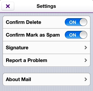
At the very end of the menu are Tools, namely Settings (which are light), and then two buttons for "Share This App" and "Rate This App." It would have been better if Yahoo! had dropped these last two promotional buttons, and instead included more in the Settings, like out-of-office or vacation message controls, as Gmail has done. The settings in Yahoo! Mail cover the bare minimum: Confirm delete, confirm mark as spam, signature, and areas to report a problem or read more about Mail (which only shows the version number of the app).

When you first install the app and login, you can opt to receive push notifications, which Yahoo! has designed well but implemented less successfully. Standard push notification displays, like being able to see the subject line and sender of a new email from the lock screen, work fine, but the badge number count of unread mails is buggy. It continues to tell me I have one unread piece of mail, even though all my messages are clearly read. The Mail app knows all the email has been opened, so something's off in Yahoo!'s app.

Emails display cleanly, even those using HTML (see the image below). I'm not sure if some of my image-rich messages loaded in full because I've marked the sender as safe, but in the stock Mail app, the same messages appear as having broken images.

There are two more areas where Gmail's iPhone app trumps Yahoo!'s: Threaded messages, and support for multiple accounts. Gmail always colour-codes email threads by sender, so you can tell at a glance when a new person replies. Google also lets you have multiple Gmail accounts right in the one mobile app. Yahoo! just doesn't offer these features, although it has only just been released. Over time, it will hopefully learn from its competition.

Verdict

Both the Yahoo! Mail app and the iPhone’s native Mail app connected to a Yahoo! account do a fine job of getting your messages to you when you're not sat in front of a desktop computer. Which one you choose is largely a matter of how you use email. The Yahoo! app works well for those who visit every nook and cranny, from custom folders to the Outbox, frequently. It's also much more engaging for graphic-rich emails. But to see all your mail from all your accounts at once, the Mail app is still the place to be.


uk.yahoo.com

Gmail - email from Google for iPhone Review


Since the release of the standalone Gmail app for the iPhone, Google has tweaked and fine-tuned the program mighty little faster, cleaner, more streamlined, and now version 2.0 of the app includes support for multiple accounts, and the search function is more satisfying.

You can already use Gmail on your iPhone, iPad, and iPod touch via Apple's bundled Mail application, but free apps Google itself is simply a better experience, especially for the search. Many people, I believe, will continue to use Mail as their primary email application because it shows you how many inboxes of multiple services at once, but you will want to search at least the Gmail app. And if you are just a Gmail user, can - and very likely will - completely replace Apple's Mail application.


Mail vs. Gmail

The Gmail app benefits from a clean and clear design, with a collapsible menu pane appearing to the left of the central interface, similar to the Facebook iOS app (and increasingly other apps, too).

Toggle the menu open, and it nudges its way into view, taking up not more than half the screen so that it's roomy and easy to read. Here, you can find the requisite Gmail folders, such as Important, Sent, Drafts, and Starred, as well as all the custom folders you've made. Labels, the Trash, and an All Mail button appear at the bottom of the menu, while the top contains a button that lets you quickly switch between your various Gmail accounts.

The Settings, also accessible from a button at the top of the main menu, has one invaluable feature for mobile users: Controls for automated vacation response emails. Who hasn't returned from traveling and forgotten to switch off that interminable out-of-office message? And, the moment you remember, you're never by a computer. Now you don't have to be.


There's a menu listing for Chats, although it's not an active messaging service; it's just a folder (which appears in your web-based Gmail account, too) where your chat conversations are saved if you enable a setting. When you preview messages, the majority of text in the Gmail app appears in light grey type, indicating read messages. The only time you'll see bold or black is for unread mail. Compared to the bold, black lettering of cascading point sizes used in the Mail app, Gmail's text is much harder to read.

Open a message, and each person on the thread appears in a different colour, using the same colour-coding scheme seen on the Gmail website. Whoever initiates a new email has his or her name in green. The first respondent shows up in purple. The third is red, and so on. Threading the messages in this way is a signature Gmail feature.

Message text appears in whatever colour text the sender uses (usually black, with blue for hyperlinks), although other information, such as the sender’s details in a forwarded message, appear in a harder-to-read light grey.

In terms of search performance, the Gmail app outperforms Mail easily, because it searches your entire mailbox, whereas the Mail app prevents you from searching beyond the folder that's open (usually the Inbox).

You can search all Gmail mail from the Mail app, but you have to first navigate to the All Mail folder within your Gmail account, and even there it's restricted to the messages that are loaded. The Mail app gives you results letter-by-letter as it finds matches, in part because it's only searching a limited subsection of your entire mailbox. Gmail waits until you've typed all your letters and hit "Search" before embarking on the hunt to match the terms anywhere in your mail.

Verdict

Both the Gmail iOS app and the native Mail app connected to a Gmail account do a fine job of getting your messages to you when you're not in front of a full-sized computer. Which one you choose is largely a matter of preference, although I think anyone who uses Gmail nearly exclusively will opt for the official Gmail for iPhone app from Google. It's smooth, fast, and now supports multiple Gmail accounts. Indeed, it’s only slight weak spot is in terms of the available customisation options.

Personally, I use about five email accounts regularly, two of which are Gmail-based, and I use both the Mail app and Gmail app. I like the Mail app because it provides an overview of the activity across all my personal accounts, whereas I access office email from the Gmail app, where search often matters more than in my personal email.

If search is of the utmost essence, you'll definitely appreciate the Gmail app, even if, like me, you end up using both apps. This app is, without doubt, a superb effort from Google, and of course it’s free to download and use.