Twitter remains one of the most active and attractive social networks. And the mobile experience is key to its success. The official Twitter iPhone app (which is free) balances simplicity with essential features, such as the ability to maintain more than one account from the app, adroitly enough to keep it relevant among contenders. It also doesn't hurt that Twitter purchased its main competitor TweetDeck, thus preventing that app from outpacing its own.Stability and reliability also count for something, and while Twitter delivers well enough on both counts, it's still far from perfect on either. Drafted tweets sometimes hang in the ether until you delete them and start afresh, and the site goes down from time to time.
Design and features
A clean user experience and smart design put the Twitter iPhone app in the big leagues. In the early days of Twitter, its own apps weren't as competitive and feature-rich as those which third parties built for the 140-character-driven social network. The iPhone app was Twitter's first mobile version to fully mature, and after five major iterations (this review is of version 5.2) the official Twitter-branded app is the way to go for many users. Best of all, if you don't have a Twitter account and aren't interested in joining, you can still use the app to search and read the site.
After downloading and installing the Twitter app, you can start using it immediately, even before you authenticate an account. The app mimics Twitter's website by allowing even non-members to search and read the site, a token feature that will surely win over lurkers far and wide.
More likely than not, though, if you're downloading the app, you do have a Twitter user name and password, and perhaps more than one. To add more accounts, you first have to be logged in – then tap the options button (three circles at bottom right), select Accounts & Settings, and use the plus sign at the top right to add more accounts. After you've set up all your accounts, you can toggle between them using the Accounts button. Switching among accounts is easy, fast, and efficient.
Rather than bombard your eyes with a rainbow of colours, the Twitter app sticks to a more sophisticated colour scheme of black and white, reserving muted shades of digital bluebird blue for the top of the screen only. It looks practical without being too serious, a simple design that takes into consideration the growing number of business users and content on the site. The app's look is sharp enough to still be appealing to people who use Twitter for personal or casual reasons, too.
A nice touch on the interactive side: Double-tapping the home icon at the lower left forces the window to scroll back to the top automatically, which means less finger flicking for users.
Photo effects
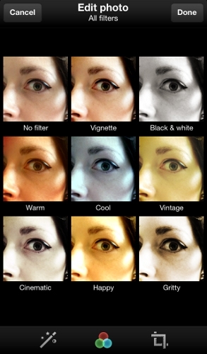
 The newest feature, photo filters, mimics the basic functionality of photo sharing site Instagram to a large extent, and it's only available on Twitter's mobile apps, not the website. Snap a photo using your iPhone, and Twitter offers dramatic filter effects, cropping and resizing tools, and an auto-enhance button.
Twitter has eight photo effects in all: Vignette, black and white, warm, cool, vintage, cinematic, happy, and gritty. A ninth option in the interface is "No Filter," which I'm going to say doesn't count. You can see all the photo filters applied to the same image in a grid, helping you decide which one is the best fit, which is quite different from the Instagram experience in which you swipe through previews but can't see side-by-side comparisons. Twitter also does offer the ability to page through the images one by one in a slideshow, if you prefer (I don't).
Drafts
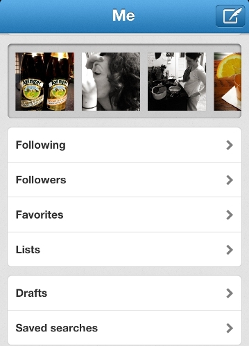
 Each account has its own options panel, where you can access your profile, account settings, user lists that you follow, favourite tweets, and drafts of tweets that haven't been sent yet. Drafts would be one of my favourite features of the Twitter app, except that it's slightly confusing when you look at the options that are available.
It seems as if you can enter the draft area and write a message (pen-on-paper icon) to save as a draft. But once you compose your message, the options are "send" or "cancel." There's no "save as a draft" immediately apparent; there is an option to "save as draft" if you select cancel, but I hate that it's not where I expect it to be.
If you select send, the message goes live immediately. Tweets also save as drafts when the site goes down or you have connectivity problems. But in my experience, these drafts can sometimes hang in limbo for eternity, never posting no matter how long I wait after regaining service. All that's left to do is copy the text, delete the original message, and paste the content into a new tweet.
Twitter's iPhone app doesn't have the ability to schedule tweets to post at a later date and time, a highly desired feature. Social media power users who need this feature can find it in an aggregation app, like Hootsuite and Seesmic.

No comments:
Post a Comment